Streamlining Collaboration on MarkUp.io
Creating a Seamless Integration of Comments and Context
CASE STUDY
OVERVIEW
MarkUp.io is a visual feedback tool designed to simplify the feedback process for teams. However, the previous version required users to switch between the sidebar and canvas to associate pins with comments. How can we make it easier for users to navigate feedback efficiently? I led the redesign to transform the feedback experience. Now, users can perform all interactions traditionally confined to the sidebar directly on the canvas.
MY ROLE
Sole Visual and UX Designer — discovery, user research, design strategy, UX/UI design, iterative prototyping
UX Methods
Comparative and Competitive Analysis, UX/UI Audit, Affinity Mapping, Feature Chart
YEAR
2023
PROBLEM
The current system for viewing comments and feedback is disconnected.
Users have to constantly switch between the sidebar and the canvas to associate pins with comments.
SOLUTION
Integrating comments directly onto the canvas will improve the user experience by creating a seamless and efficient workflow.
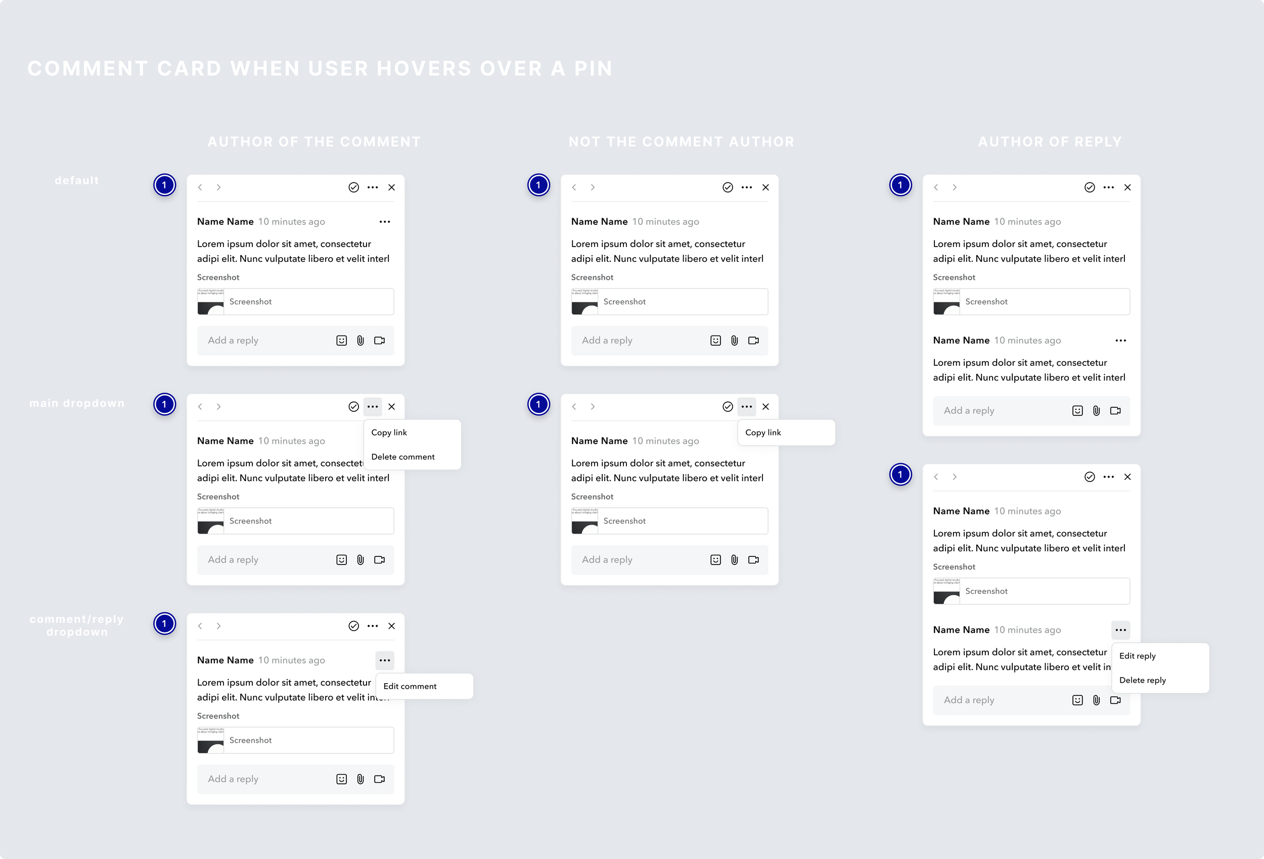
A clear visual connection between pins and comments is crucial for easy navigation, especially with a large number of comments. The user should rely less on the sidebar and instead be able to review feedback directly on the canvas. This approach allows users to view feedback within the context it is given, and speeds up the review process by enabling them to view, edit, reply, resolve/unresolve comments directly on the canvas.
PRIORITES
Designs should include the following features:
fix major UI problems
the ability to switch between comments quickly
the option to reply and edit comments directly on the canvas
the ability to take key actions from the canvas, including resolve, edit, reply, unresolved, and view attachments/screenshots.
If you’re interested in seeing all of my final designs for this project, please view my Figma handoff file here. Thank you!


